Nixeus VUE 30: 30" 2560x1600 IPS Monitor Review
by Chris Heinonen on August 20, 2013 6:00 AM ESTAdobeRGB has a much larger gamut than sRGB. Even if we can’t control the gamut on the Nixeus VUE 30, moving to a larger gamut target should result in smaller errors overall. If this improves things this might work well for those doing color work, as they may want the larger gamut anyway. For normal use like gaming or web browsing, very few applications use AdobeRGB so it won’t be improved.
| Post-Calibration, 200 cd/m2 | Post-Calibration, 80 cd/m2 | |
| White Level (cd/m2) | 199.7718 | 81.959 |
| Black Level (cd/m2) | 0.3455 | 0.1473 |
| Contrast Ratio | 578:1 | 566:1 |
| Gamma (Average) | 2.1975 | 2.351 |
| Color Temperature | (missing) | 6521K |
| Grayscale dE2000 | 0.8217 | 0.8328 |
| Color Checker dE2000 | 1.3821 | 1.5443 |
| Saturations dE2000 | 1.5282 | 1.6211 |
Besides the gamut, I left every target the same as with our sRGB calibration. As we can see, we get far, far better results for the color than we did before. The performance for the 80 cd/m2 target has also improved a lot with the grayscale. That shouldn’t have been affected, but it could be a better calibration run, as sometimes the software does better than other times. The visible difference with an average dE2000 of 1.33 vs. 0.83 for the grayscale is pretty minimal and hardly noticeable in real life.


The big change is the colors. While Red still falls outside of the AdobeRGB gamut, Green, Cyan and Yellow all line up nearly perfectly now. Magenta is still affected by the Red, but even those two colors are much closer to accurate than before. A quick look at the saturations table shows that the dE2000 stays below 3, or the visible error level, for every color except for highly saturated Red and Magenta. The 96-point Color Checker chart shows the same results, with those highly saturated red shades providing the only errors that really fall into the unacceptable realm.
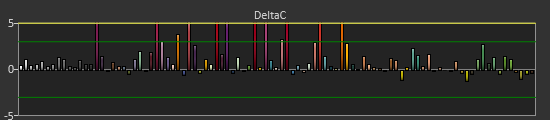
One key chart to look at that I’ll pull out here separate from the gallery is the Delta Color Error on the Color Checker chart. As you can see, the Red shades are highly affected by an over-abundance of color here. If I were to pull out the other charts that break down the individual color errors, Delta Luminance and Delta Hue, you would see that those errors are virtually non-existent. The issue is that red has too much saturation, but the light level and the tint on it is correct.
Moving to the AdobeRGB target really improved the performance of the Nixeus VUE 30, but that isn’t without a caveat or two. Most people don’t use AdobeRGB color, and most applications don’t support the larger gamut. For those applications you are still going to see overly saturated colors on a regular basis and this won’t correct them. However, for people that can use AdobeRGB, color accuracy might be more important to them than it would be for someone that doesn’t use it.
If you are only gaming or doing general office productivity on this display, you might not care about the over-saturated gamut. If you are going to be doing photo work you certainly would, and hence this AdobeRGB target might solve your issues. If you want to have accurate colors on the Nixeus, this is the only way you can really get there, and you’ll likely know if this will work for you.


95 Comments
View All Comments
Sabresiberian - Tuesday, August 20, 2013 - link
It is great to see prices drop this much, but the standard 30" screen still has a serious problem, in my eyes. .25mm dot pitch.Okay that isn't terrible; it's something I could live with. But the fact is, I can buy a 27" with much better dot pitch (.233mm) and spend a lot less money. I hate the 16:9, but it isn't as bad as .25mm for me in that large of a display, personally, so the trade-off means I'll go with spending less money to get something a bit closer to what I want.
Give me 16:10.
Give me at least (most?) .233mm dot pitch, - better certainly isn't an unreasonable thing to ask in this day and age.
Give me an IPS panel (or comparable, or, gasp even better!), preferably with a backlight solution that doesn't feel like a heat lamp shining on my face.
Give me accurate colors, a uniform display, screen surface that isn't too reflective OR to heavily anti-reflective, a thin bezel so I can put 3 of them side-by-side without big spaces between the displays..
Give me low lag.
Sell it to me for less than $600. Really, I think $500 isn't unreasonable, but I'll buy it at $600.
JarredWalton - Tuesday, August 20, 2013 - link
Windows still doesn't handle odd DPI all that well, though 8.1 may improve this. As someone who has used 30" LCDs for years now, I will tell you that I have no issues with the dot pitch, and in fact I often have to increase the magnification to read text comfortably. I think a dot pitch for desktop displays of around 0.28-0.30mm is actually better for most people past 30 years old. For businesses with 40+ year old employees, I have had many instances where I had to set their 1080p or 1920x1200 display to run at a lower resolution because the user complained that the text was too small.So, sorry to burst your bubble, but in the larger market of the world (e.g. people older than 25) having higher DPI is not actually all that important or even desirable. Not to mention, if you had a 4K 25" display, you need GPUs capable of driving that resolution at a reasonable level of performance. Just like the business world doesn't worry too much about high DPI displays, they're not interested in high performance GPUs for general computer use either.
josephandrews222 - Tuesday, August 20, 2013 - link
GREAT comment about dot pitch and age. I'd like to see an anandtech article about dot pitch that addresses this very topic...in detail.Impulses - Tuesday, August 20, 2013 - link
These displays aren't marketed at the business world either tho...stephenbrooks - Friday, August 23, 2013 - link
Right on with the dot pitch comment. I recently got to work on a 27" 1440p display and felt I had to set the Windows 7 UI & font scaling to 125% rather than 100% (I'm 29). The side-effect was that 125% looked kind of "Mac like" with high res fonts still the same size, whereas 100% was like trying to work at a scale designed for ultraportable laptops.seapeople - Saturday, August 24, 2013 - link
I call BS. My eyesight is TERRIBLE. I can't see the broadside of a barn if it was flying at me and mooing. But I have these wonderful things called glasses. It's not like glasses stop working when you get older. I currently am sitting about 24 inches from my 125 ppi laptop screen and I can still tell that the text is not nearly as clear as it could be (i.e., on the retina iPad). For example, > ... that's not a smooth, clean arrow, it's a blocky/fuzzy travesty that would look so much better with more pixels in it.menting - Tuesday, August 20, 2013 - link
Does this monitor use PWM for brightness?I wish more monitor reviews would cover this section as well, as I (and quite a few others) find PWM annoying and tiring to the eyes
mdrejhon - Wednesday, August 21, 2013 - link
You can test a monitor's PWM by using http://www.testufo.com/#test=blurtrailmdrejhon - Wednesday, August 21, 2013 - link
Oh, and when testing TestUFO, make sure to use the Chrome browser, and lower brightness to 0% to check for the PWM artifact.ezridah - Tuesday, August 20, 2013 - link
You should review the 4 different Monoprice monitors. They have 2 types at each size and the low end ones are significantly cheaper than this.