Samsung S23A750D 3D LCD Display
by Chris Heinonen on December 17, 2011 2:45 PM ESTSamsung S23A750D Brightness and Contrast
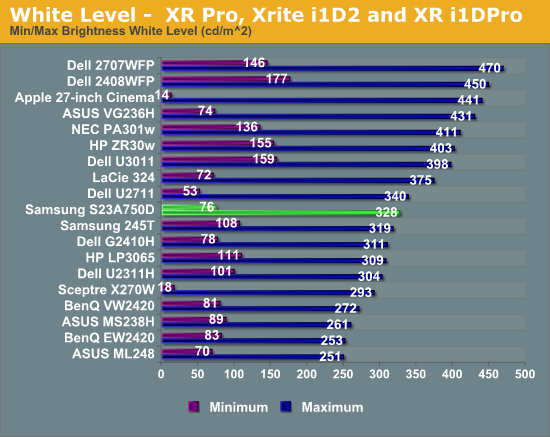
The S23A can produce more light output than many monitors, with over 300 nits of light output possible. While in most cases I would say this kind of light output is a crazy amount that few people will use, the highly glossy screen on the Samsung might make this much light output useful if you have a lot of reflections around your work area from windows or overhead lights. Additionally, Active 3D glasses will cut the light output in more than half, as each eye only views the display half the time and they have tint to them, so ~25% of that light output would be 80 nits. It also manages 76 nits with the backlight brightness set to the minimum, so that gives you a very wide range to adjust the monitor to your preference.
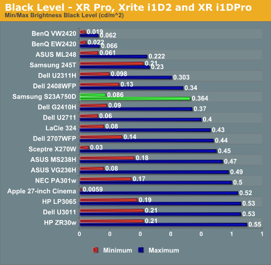
The black output level on the Samsung falls right into the expected range for the monitor. I was a bit disappointed with this as Samsung has managed to get darker blacks out of their LED edgelit TVs, so I was hoping more of that technology would copy over to their monitors. As it is, it’s a little on the bright side for a monitor of this size.
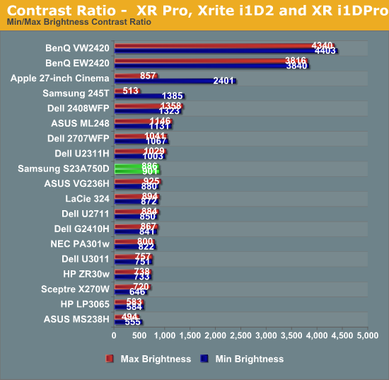
Despite the brighter whites, the black levels rise as well and so the contrast ratios are a pedestrian 900:1 on average. That's neither spectacular nor disappointing; the contrast ratio is merely average for 2011. As usual, we test without dynamic contrast enabled, as the change in backlight intensity tends to be visible and distracting, though Samsung claims up to a 5 million to 1 contrast ratio with dynamic backlighting. (I'm not sure how they'd get there, considering the maximum white level divided by the minimum black level only results in a contrast of 3813:1; they would almost need to shut off the backlight entirely to get down to the necessary 0.000064 nits black level.)
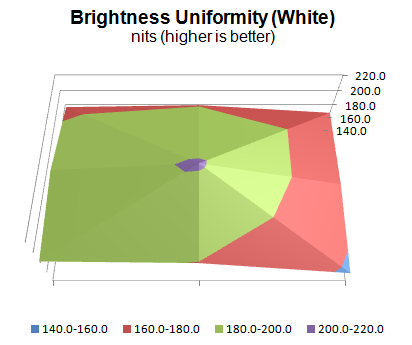
The brightness uniformity of the S23A comes in as merely average as well. With the center at just over 200 nits, only one other area of the screen measured over 190 nits, and only one more was even over 180 nits, with the lower right of the screen measuring over 20% darker than the center.
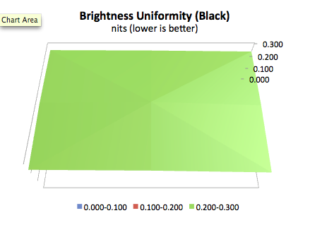
The black uniformity was a little better, though the higher black level overall meant that none of the values were spectacular. The same lower-right area that was darker in the brightness measurements was also darkest in the black measurements, so the backlight just seems to not be as powerful in that area.


80 Comments
View All Comments
DParadoxx - Saturday, December 17, 2011 - link
Chris, there is an OCZ 850 PS gallery on page one. I suspect this is unintentional.DParadoxx - Saturday, December 17, 2011 - link
Spoke too soon, I see it is.Iketh - Saturday, December 17, 2011 - link
Sorry to be a d**k, but I could only glance through the article. It felt like is was written by a 7th grader. Not AT worthy.MonkeyPaw - Saturday, December 17, 2011 - link
I'm sure your thoughtful and constructive comment will really be a force for change at AT.Kristian Vättö - Saturday, December 17, 2011 - link
It's really no use to criticize unless you can be more specific. What is wrong with it? The writing style or the knowledge of the writer? Or something else?Haters are always gonna hate. If you want things to change, the way is to provide feedback and tell WHAT IS WRONG.
Galcobar - Saturday, December 17, 2011 - link
The writing style is more juvenile, hyperbolic and chatty than I've come to expect from Anandtech. There are also some grammatical issues which obscure meaning. As a result the reader has to sift the article more carefully for the relevant information.Clear, concise writing which conveys the information precisely indicates a greatery mastery of the subject material. The author may have a complete grasp of the issue, but it is not presented in a manner which would lead the reader to trust the author's, erm, authority.
MonkeyPaw - Saturday, December 17, 2011 - link
That's a much better way to put it. Nice ironic twist in there too. :pReikon - Sunday, December 18, 2011 - link
Yep. I've been saying recently that AT is going down in quality. These new writers just aren't any good. Their writing style and content just isn't up to the old standards.I mean, look at those pictures of the OCZ PSU on the first page. Someone even thought they were included as an error. This isn't a blog. Don't write about how your computer couldn't handle 3D and then detail how you upgraded it to support it. This isn't a case or PSU review. We don't need to know the details of your PSU installation for a monitor review.
claytontullos - Sunday, December 18, 2011 - link
agreedjohnf1285 - Monday, December 19, 2011 - link
I agree with this too. I was thrown off when I was reading through the article, and glanced down to see a photogallery with pictures of a PSU.