Original Link: https://www.anandtech.com/show/9380/os-x-el-capitan-first-look
A First Look At Apple's OS X El Capitan
by Ryan Smith on June 15, 2015 3:00 PM EST- Posted in
- Mac
- Apple
- Operating Systems
- macOS
Right on schedule, at last week’s World Wide Developers Conference Apple announced the next iteration of their desktop OS, OS X. Version 10.11, dubbed El Capitan, is the latest in Apple’s string of yearly OS updates. And with this now being the 3rd iteration of the company’s initiative to offer free desktop operating system upgrades, it’s safe to say that the company has settled into what is the new norm.
From an OS perspective, WWDC straddles an interesting point between announcing new OSes and priming developers for them. The sole public session of the conference is the Keynote, where Apple announces the newest versions of OS X, iOS, and whatever other major initiatives they have going on. However once the keynote is done, that’s it for the public. The company has plenty of other activities going on at WWDC, but those are closed door events for attending developers. Ultimately there’s no practical way for Apple to announce something major like a new OS to developers without the news leaking, so the company instead does a public announcement to get consumers and developers excited while neatly sidestepping the immediate issue with keeping such a big secret, and then closes up to get to work on preparing developers for their latest OSes.
Of course developers can only do so much without seeing the OS first-hand, so along with serving as a developers conference and keynote backdrop, WWDC also serves as the launching point for Apple’s OS betas for developers. Over the next few months OS X and iOS 9 will go from a developer beta to a public beta, and finally to retail products. Which is to say that developers get to have all the fun of actually interacting with the OS first, as the public beta won’t start for another month or two.
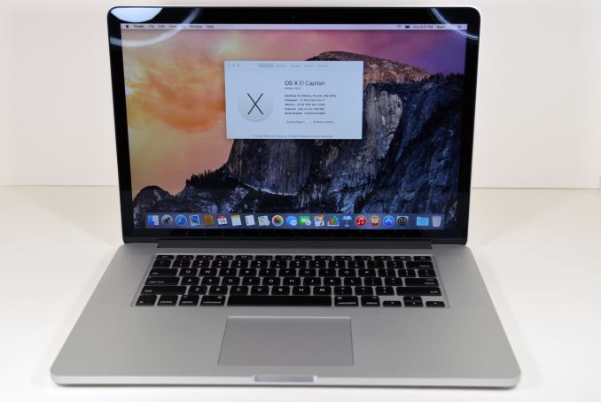
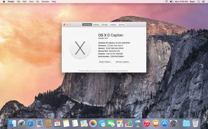
And that, at last, brings us to today. With thousands of developers and no practical way to keep the OS from leaking, Apple is seemingly trying something a little different this year when it comes to engaging consumers and the press during the developer beta period. Rather than clamming up entirely – developers are under non-disclosure agreements – Apple invited us to take a first look at the beta OS, loaning us a 2015 15-inch Retina MacBook Pro with OS X El Capitan preloaded. To that end, today we are taking our first look at El Capitan, checking out the major new features of the OS and experiencing first-hand the software Apple is putting together for later this year.
Now make no mistake, this is a beta OS and it has problems like any piece of beta software does – Apple does not withhold OS betas from the public just because they like to be secretive – but it’s an increase in transparency from a very opaque company. More to the point, while El Capitan still has some debugging to go through and a few teething pains that come with it, it’s already in a state where it’s usable, where the major features are in place and working, and the bugs Apple hasn’t already squashed can be worked around by an experienced hand. So with that in mind, let’s take a look at what Apple is gearing up for with the 12th iteration of OS X.
Sizing Up El Capitan
First off, to address the obvious question in the room, why “El Capitan?” With Apple dropping the big cat codenames a couple of years back, they have now started naming OS X after California landmarks. With 10.10 Apple named the OS after Yosemite National Park, and now with 10.11 El Capitan, they have gone one step further and named the OS after the El Capitan rock formation.
El Capitan is admittedly a bit of a mouthful, especially if you’ve never heard the accent pronounced before (it’s pronounced el-KAP-i-TAN, by the way), however the name is fitting from a development standpoint. Whereas Yosemite was a major OS release for Apple, involving a significant UI overhaul along with numerous feature upgrades, El Capitan is a far tamer excursion for Apple. It’s still an important release for its own reasons, but it’s definitely an iteration on Yosemite rather than another major change; it is the Mountain Lion to Lion, the Snow Leopard to Leopard. So it’s only fitting that with such close ties to Yosemite, it’s named after a rock within the park.
Ultimately with the company no longer charging for OS updates, they can afford to take on a build-and-optimize approach, since no matter how many new features an OS comes with it’s still free. At the same time it means that El Capitan gets to build off of a solid base in Yosemite, which means Apple can focus on other areas of the OS.
So what does El Capitan bring to the table? Over the next couple of pages we’ll lay out the major features, but in a nutshell it’s an interesting combination of some further harmonization with iOS, some new features for the OSes major applications, and even some core technology updates. Mentioning iOS and OS X in the same breath always draws a few groans, and while some of the iOS elements that have come to past OS X releases has been more tepidly received than other elements, in the case of El Capitan it feels like Apple has a better grip on harmonizing the OSes without losing what makes OS X unique, and what makes a desktop OS work best.
Applications: Safari, Maps, & Notes
We’ll start off our look at El Capitan with a look at the major application updates in the OS. The application updates generally fall into three categories: outright new features for OS X, new features that are being brought to OS X and iOS simultaneously, and finally features that are coming to OS X after already appearing in existing versions of iOS.
We’ll start off with Safari, OS X’s included web browser. Now up to version 8.1, Apple isn’t instituting a major overhaul of Safari at this time (no more than they are the rest of the OS), but they are rolling out several new features for the browser, which like the OS itself, is essentially on a yearly cadence for feature updates.
I suspect the most popular of these features will be the tab audio functionality, a welcome addition that sees Safari pick up a pair of tab-related audio features. First, Safari can now display which tab has audio emanating from it. This is something rival Chrome has had for roughly the last year, and is extremely helpful in tracking down a noisy tab that is playing audio when you’d rather it would not, be is a video that you’ve forgotten about, or an audio-enabled ad that shouldn’t be there. A tab with active audio is identified with a speaker icon along the tab, and a second, global icon in the URL field.
Going hand-in-hand with the ability to identify noisy tabs is the ability to put the kibosh on them. By clicking on any of the speaker icons (tab or global), you can mute the tab you’ve clicked on, or the currently active tab respectively. Alternatively, holding on the aforementioned global tab audio icon, a menu will come up that lists the tabs with audio and offers similar controls.
Meanwhile another major addition here is support for pinned tabs. Similar to Firefox, important tabs can now be pinned, to act as a combination of a tab and as a more powerful favorite. A pinned tab is permanent (unless removed) and will always go to the site it has been pinned to, and its size reduced to just large enough to show the favicon of a site.
Browsing within a pinned tab results in a few different behaviors. If you stay within the site, then you will stay within the pinned tab. Whereas leaving the site results in the equivalent of opening a link in a new tab, with the off-site link getting its own regular tab. Meanwhile pinned tabs are always open so long as the browser is open, and restarting the browser and going to a pinned tab will take you to the last page that tab was showing.
Finally, Apple has made a couple notable low-level tweaks to Safari. AirPlay and Safari now have the ability to hand-off unprotected HTML5 videos to the Apple TV, which under the hood works by passing the URL of the stream to Apple’s media hub. Safari has also learned some of Spotlight’s newest tricks (more on that later), able to show some of the same information directly, such as sports scores and weather.

Safari Search Learns Some New Tricks
Maps
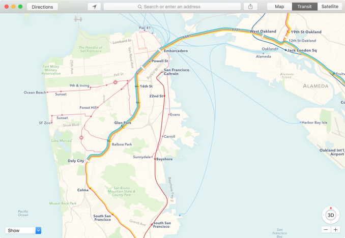
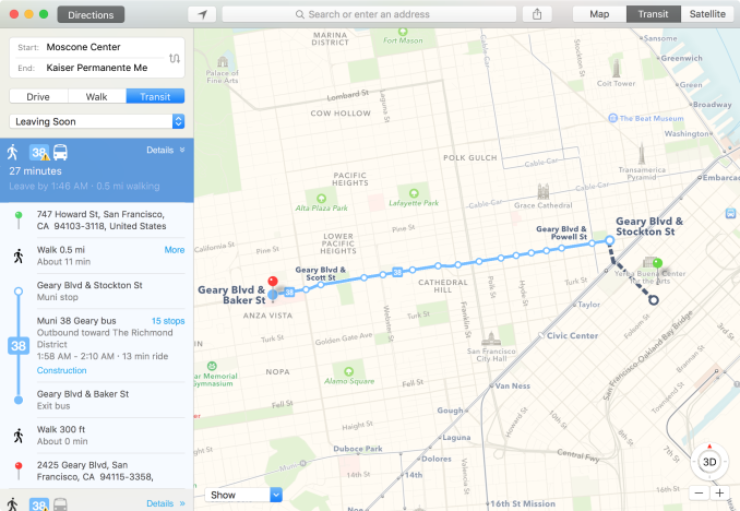
Up next is El Capitan’s Maps application. Like its iOS counterpart, Maps has learned how to use public transportation. With this knowledge, Maps can now provide information on public transit, and use that information to plan out routes that utilize it.
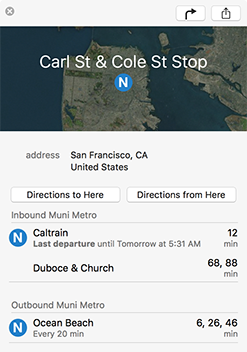
The interface for this feature is through the new Transit map option, which utilizes a pared-down version of the traditional street map with transit information such as fixed-path trains and subways. By going into this screen you can see the major routes, but also pull up information on stations by clicking on them, a feature Apple calls a station place card.
However the biggest benefit here is using Maps to plot out trips, by getting step-by-step directions from within the Transit screen. Doing that, Maps can then provide a list of different ways to go from one location to another, combining all available public transportation options with walking. The default sort is by time, with the ability to ability to select when you want to leave, all the while walking distance is helpfully listed as well in case you want to minimize walking. Finally, because iOS is getting the same upgrade, Transit information can then be sent over to iOS/Watch devices for once you’re on the move.
For what it needs to do, the new Transit function works fine. As for whether that’s a useful addition or not, it’s going to depend on your location. Snark about the state of US public transportation aside, it’s telling that the only two US cities in the current beta are San Francisco and New York, all the while over 300 Chinese cities are supported. Apple will be bringing more cities online for the full release and adding even more cities beyond that. Otherwise the value of the feature will depend on the utility of your local public transit options.
Notes
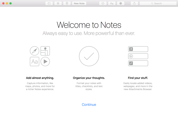
Another application that is receiving an update alongside its iOS counterpart is Notes. Apple’s note-taking application is getting a rather significant upgrade here, going from a simple text organization system to a fuller-featured system capable of handling multiple data types and more complex text, along the lines of Evernote or Microsoft’s OneNote.
On the text side, Notes is basically becoming a small word processor. Notes can now write out text in a number of formats, including multiple text sizes (equivalent to HTML headings) and the usual list types. Along with this, Notes can now also create checklists, making Notes an impromptu to-do application as well.
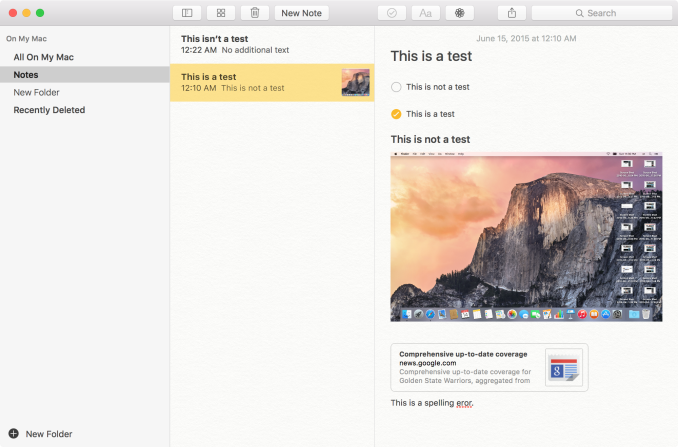
Images, Text Formatting, URLs, Folders, & More
More significant however is that Notes can now embed a great deal of other content besides text. Pictures, audio/video, map locations, sketches, websites, and even other documents from Apple’s iWork suite can now all be placed in a note. A note has now essentially become a free-form container of sorts, holding a lot more than text.
In fact Apple has added a couple new features to help organize all of this data. Notes themselves can now be placed in folders, rather than being a flat list as before. Otherwise Apple has also added a whole new “attachments browser” mode just to help visualize all of this, allowing for multimedia content that has been imported into a note to be collated separately.
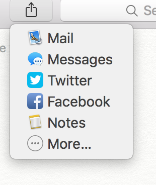
Getting that content into notes can be accomplished a couple of different ways. The OS X standard of drag & drop works well, however as OS X Notes is harmonized with iOS Notes, that means it also gets the ability to receive content shared from other applications via the share menu. Notes is now a share target, available in applications that utilize sharing and know how to send their content to Notes. And of course, OS X and iOS Notes share with each other; these enhanced notes can be synchronized via iCloud.
Applications, Cont: Mail & Photos
Moving on, we have Notes’ parent application, Mail. Mail’s suite of enhancements walk the line between new functionality just for OS X, and some functionality being brought over from its sibling over on iOS.
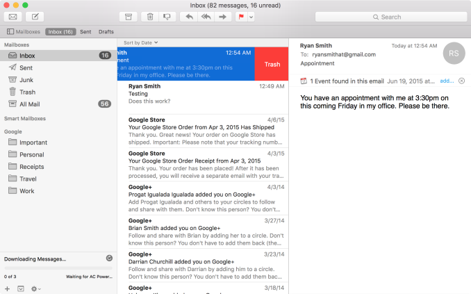
On the input side, Mail for OS X is learning some touch inputs from iOS Mail. Similar to iOS, you can now swipe on the trackpad to manage a message, trashing it, flagging it, etc. This swipe functionality operates a bit differently than on iOS, owing to the fact that the trackpad is an indirect device as opposed to a direct device, so certain actions require larger gestures and/or come with confirmations that the direct-contact iPhone and iPad can more safely avoid.

Contextual Awareness: Find Events In Emails
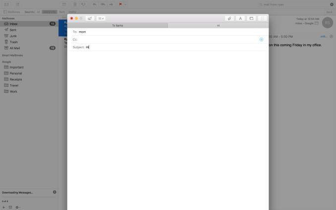
Apple has also done quite a bit on the interface side, giving Mail a bunch of new functionality in full screen mode. Full screen mode is now a windowed environment onto itself; mail can be opened up into its own tethered window, and minimized to a bar on the bottom of the screen. Mail composition gains the same abilities and more, as not only can mail be composed in a tethered window, but mail composition can be tabbed as well, allowing for several messages to be composed at once all within the full-screen environment.
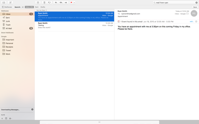
Full Screen Mail: Tethered Windows, Tabbed Mail, Minimized Windows
To be honest the full screen changes caught me off-guard at first, if only because it seems to be such an odd place to focus. I’m curious how many of our readers regularly use Mail in full screen mode, as this is a rather application-specific change. Within the context of Mail being a full screen application the windowing changes make a ton of sense, allowing Mail to be far more usable in full screen mode. But then OS X was already a windowed operating system. I am either greatly underestimating the number of people using Mail in full screen, or perhaps Apple wants to test the waters for the kind of features that would be useful in a smaller device without full windowing features, like the iPad.
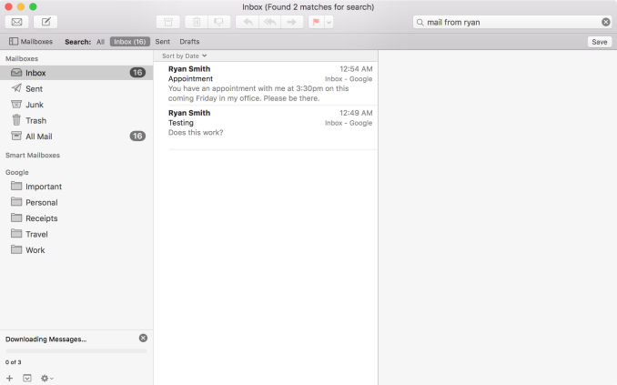
Interface changes aside, another improvement found in Mail for El Capitan is that Mail is much more contextually aware than it used to be. Apple has taught it to recognize new types of data, including other names and dates/appointments, so that this information can be fed into Contacts, Calendaring, etc. However on a broader level, Mail now also understands natural language search to an extent. Asking it to show emails from a certain person for example will do just that. Power users will already understand search queries and be able to more finely craft them – so specialized queries aren’t going anywhere – but for more basic users natural language search offers a new and potentially more intuitive manner of instructing Mail on what to search for.
Finally, under the hood Apple has been making some tweaks to the IMAP engine for Mail. Overall Apple is claiming an up-to-2x performance improvement in IMAP performance, and at the same time Apple has changed the order that IMAP messages are imported in so that the newest messages are downloaded first. We’ll have to see just what IMAP performance is like once El Capitan is out of beta, though changing the download order is a very straightforward and useful alteration to how the application works.
Photos
The final application seeing a major facelift is Photos. Now up to version 1.1, Photos incorporates several improvements. Lower key improvements include a number of usability enhancements. Photos can now batch edit image titles, sort album art, and add/edit location data in images. Meanwhile Apple has added an interesting new face detection feature simply called Faces, which allows for photos to be organized by the faces in them (and on a side note, I’m curious whether this is GPU-accelerated). I haven’t had too much of a chance to play with Faces in such a short period of time, but it has done a fairly good job of picking up on faces even in photos where those aren’t the primary subject.
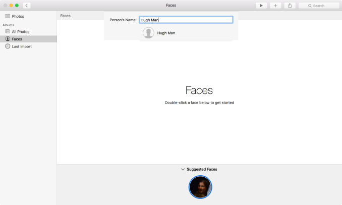
Photos: Face Detection & Organization
The bigger news here – and unfortunately not fully enabled in the developer preview – is support for extensions. Taking a page from Safari, Apple will allow developers to create editing extensions for Photos and then distribute them through the Mac App Store or bundled with their own applications. Editing extensions in turn can be used to add new editing or filtering effects to Photos’ editing capabilities, allowing for greater editing capabilities than what is currently built into the application.
As it stands there aren’t any extensions available yet – developers just got started – so we haven’t been able to try out the feature. However it’s clear that Apple is envisioning an opportunity for commercial use of this feature, especially given the distribution through the Mac App Store. Photos meanwhile has a decent but rather limited selection of editing capabilities, so the path for 3rd party developers to add more high-end abilities is a fairly obvious one.
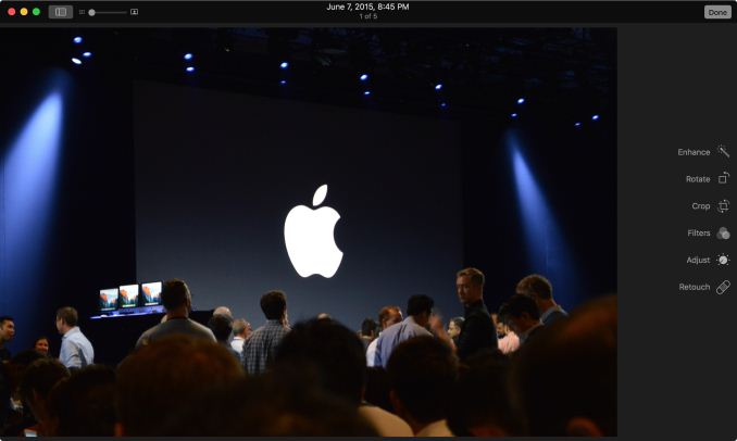
Coming Soon: Photos Editing Extensions
Last, but not least, Apple has been working on the performance of Photos as well. Launching Photos with very large photo libraries have been less than snappy on Photos on Yosemite, and Apple tells us they have addressed this on El Capitan. Their own internal benchmarks are showing a performance improvement upwards of 40% on a MacBook Pro.
Window Management: Split View & Mission Control
Although Apple’s application updates are likely to have the greatest impact for day-to-day users, that’s far from the only place the company has been working on improving the state of the OS versus Yosemite. As it turns out, Apple has also been busy working on window management, adding some new features here and revising the operation of other systems to bring about new functionality.
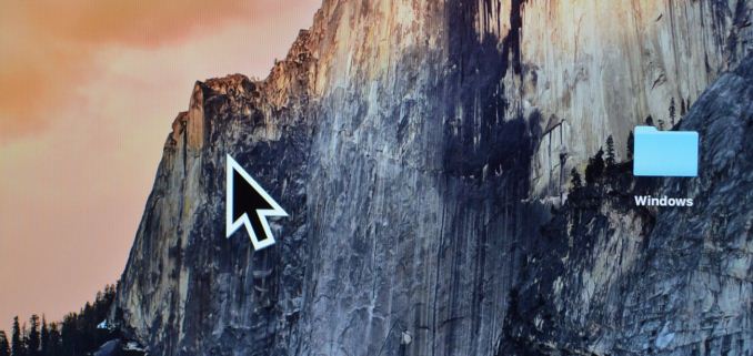
To address the elephant in the room first, Apple has added an interesting solution to the problem of finding the mouse cursor. With El Capitan, shaking the cursor – be it waving a mouse around or moving your fingers quickly about the trackpad – will cause the cursor to momentarily enlarge. Bad (and obvious) jokes aside, this feature is exactly as stupid as it sounds like. And in the process it becomes stupidly clever.
Although OS magnification is nothing new – OS X has had it practically forever – using magnification on just the cursor, and just temporarily at that, is a clever way to momentarily increase the visibility of a cursor. And the thrashing about is exactly how most people go about finding their cursor if they lose it (since humans are more sensitive to motion than detail), which makes this a very natural action. At the end of the day it strikes me as something that an engineer came up with in whatever Apple’s equivalent of “20% time” is, but it’s a dumb, effective little feature.
Moving on, let’s talk about what’s new with window management in El Capitan. Apple’s Mission Control feature is receiving some well-deserved attention with the latest version of OS X, and while there are no major changes here, Apple has made a number of smaller changes in an attempt to improve window management through it.
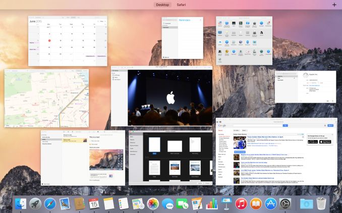
Mission Control: Now With A Single Layer
Window tiling in Mission Control has been adjusted to be flatter; no longer do windows belonging to the same application stack on top of each other, but instead they are laid out separately like another application. This is a pretty straightforward binary choice – you either stack windows or you don’t – but Apple seems convinced that hiding windows by stacking them was counter-productive (and they’re probably right). Meanwhile, how Mission Control and Spaces interact has been improved, and it is now possible to drag an application in Mission Control mode up in to Spaces to have that application put in its own space as a full screen mode application. Previously it was possible to drag applications into other spaces, but the option to go immediately into full screen mode is new.
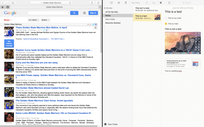
The reason for that change makes a lot more sense when we talk about the other major window management change in El Capitan, which is a new feature Apple calls Split View. Similar to Microsoft’s (Aero) Snap feature, Split View is based around the idea of setting up applications side-by-side such that each application goes full screen and takes up one side of the screen. The intention being to make it easier to focus on just using two applications side-by-side, with each application as large as it can be.
Given that background, Split View is unsurprisingly an additional function of full screen mode. Activating it is simply a matter of holding down the full screen button rather than tapping it, at which point it becomes possible to move an application to either side of the screen and to engage Split View. Doing so will then cause all other application windows to be tiled (ala Mission Control) in order to pick the other application to be used in Split View mode. It’s also possible to engage Split View via Mission Control and Spaces, dragging an application to a Space that already has a full screen application. Finally, split View mode also automatically creates a new space for the view (assuming it wasn’t already a full screen application in its own space), so the desktop remains available in another space.
As far as compatibility and adjustability go, in Split View each half of the screen is adjustable, at least up to a point. This seems to depend on the application, but we have been able to increase the split to 66/33 or so. Meanwhile compatibility is fairly good with Apple’s applications, but it’s clear that this feature can only work with applications that have a full screen mode and have the ability to be resized to fit. System Preferences, for example, can’t go Split View.
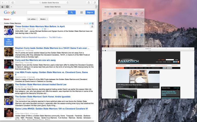
Split View: Picking The Right Application
Overall Split View is an interesting take on what else to do with full screen applications, and while it lacks a high degree of novelty since it has been done elsewhere before, Apple has clearly put some effort into polishing it and using Spaces to resolve the blindness that comes from filling up the screen. That said, given the fact that one of iOS 9’s marquee features for the iPad Air 2 is multitasking, which implements the same Split View feature, I’m not sure how much of Split View’s presence here is out of its usefulness in a desktop environment, and how much of it is based on the desire to keep iOS and OS X in harmony. I’m curious to see just how often it gets used on OS X as a result.
Spotlight Gets Smarter: More Web & Natural Language Search
In Yosemite, Apple introduced the modern version of Spotlight, their combined local & web search tool. Replacing the previous drop-down iteration that was focused on local results, the rebuilt Spotlight became a pop-over window – practically a miniature application of its own – featuring not only improved local searching, but the ability to search and preview web sources as well.
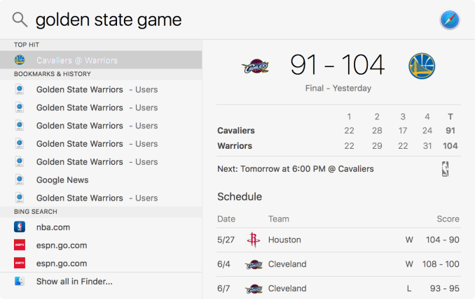
For El Capitan, Apple is taking this a couple of steps further by giving Spotlight the ability to not just do keyword searches, but to better understand the context of searches and return results within Spotlight itself. Though Apple is not being overt about it, in a lot of ways the latest rendition of Spotlight is becoming increasingly Siri-like, as it gains a lot of Siri’s abilities to present data, and not just find it as was the case with Yosemite Spotlight.
On web side of matters – and by far the most Siri-like addition – Spotlight can now return and display results directly for the weather, stocks, sports, web videos, and integrate with Safari and Maps to include some of their search functionality as well. As it stands Spotlight can still only do a fraction of what Siri does, mostly due to the fact that it lacks Siri’s deep server-side analytic capabilities, but at the end of the day it’s in many ways a pared-down version of Siri for local use, capable of directly displaying results for some very common types of queries.
The single biggest difference here is really that Spotlight is just for searching, so it lacks any kind of command functionality. However I suspect that may be just a matter of time, especially as Microsoft is integrating their competing Cortana agent into Windows 10.
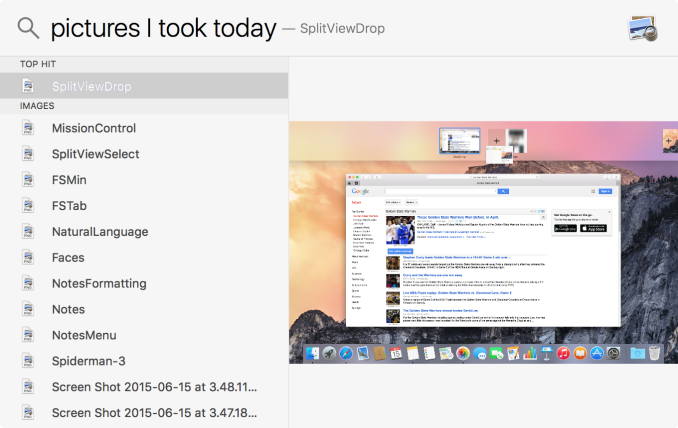
Moving on, the other major addition to Spotlight is the ability to understand natural language queries. Just as was the case in the OS’s included Mail application, Spotlight overall can execute natural language searches over documents, or over any application it is allowed to search in (e.g. Mail). As with Mail, the idea here is to make it easier to create queries, especially complex queries or queries for first time users, though all of the existing methods of searching remain unchanged.
As it stands I’m finding natural language searching a bit hit & miss. Some queries it handles well, while others it essentially fails to understand the query and falls back to web results. I suspect there’s a trick to this I haven’t quite picked up on when it comes to figuring out just what Spotlight can understand. Still, this is also a beta release and Spotlight is one of the few areas I’ve had issues with (requiring a system reboot at one point), so it may just be a case of needing to shake out the bugs.
Metal, Performance Improvements, & First Thoughts
Last, but certainly not least, there are a few more under-the-hood features that are being introduced with El Capitan that we can at least briefly talk about.
The first of these is of course Metal, Apple’s low-level graphics API. Originally developed and released for iOS 8, Metal is now coming to OS X and in a big way. Apple is not only bringing Metal over to OS X, but they are using it themselves, with Core Graphics and Core Animation getting a Metal rendering backend.
The purpose of bringing Metal over to OS X is two-fold, as it serves both Apple and Apple’s developers. Bringing Metal to OS X further aligns the two OSes, allowing iOS developers to leverage their Metal code on OS X. That in turn allows all developers to tap into the basic benefits of a low-level graphics API: improved graphics performance by reducing or eliminating the overhead that comes from traditional high-level APIs. Low-level APIs like Metal are not silver bullets for performance in and of themselves, but they open the door to better performance, especially in certain edge cases where graphics rendering is CPU-bound. The tradeoff in turn is that without the abstraction that comes with high-level APIs, Metal is harder to work with, since by its very nature it offers developers far less protection and hand-holding.
With both OS X and iOS, Apple is making use of Metal internally as well. As we mentioned previously, both Core Graphics and Core Animation have received a Metal rendering backend, allowing two of OS X’s fundamental graphics subsystems to draw right to Metal. As these systems are not traditionally heavy GPU users, the gains they stand to receive from Metal are not particularly great. However at the same time there is no good reason for a tightly integrated vendor like Apple not to use Metal for the OS itself, as even if the gains aren’t massive, this is one of many optimizations Apple can do to improve performance a bit more and to squeeze out a bit more battery life. In the case of Core Graphics and Core Animation, I suspect Apple is doing this not for any performance gains, but rather because Metal incurs less CPU overhead, and as a result using it cuts down on power consumption some versus OpenGL.
In any case we’ve already written a fair bit on Metal elsewhere, so I won’t repeat that here, but at the end of the day Metal is an important addition to the OS that will benefit developers and Apple alike by removing performance bottlenecks and improving system efficiency. Meanwhile the touted 10x performance benefit is a very narrow case that isn’t likely to occur in the short run, but in the long run developers will be well served by having access to Metal.
As for the current state of Metal on OS X, Apple has already gotten the Metal driver and Core Graphics/Animation systems to the point where you would almost never notice that Metal’s in use. With the exception of one rendering bug (the user menu), right now we would be hard pressed to tell that Apple changed the rendering backend from Yosemite to El Capitan; as it stands it just works. No doubt there are still some bugs left to work out further behind the scenes, but for such a major overall even the developer beta is in good shape.
Overall Performance Improvements & Bug Fixes
No release of OS X would be complete without some overall performance improvements as well, and Apple is certainly aiming to please. While the current developer beta of El Capitan is not in good condition for benchmarking – there will be plenty of time for that closer to release – Apple is already outlining where they have been focusing their optimization efforts. Overall application launch speeds are said to have improved by up to 40%, and Apple has also made some unspecified improvements to speed up application switching. With all of Apple’s performance numbers there’s reason to take pause, as Apple is almost certainly cherry-picking numbers from low-level tests, but it none the less gives us an idea of what to look for once the OS is farther along.
Meanwhile Apple is also telling us that PDF rendering performance in Preview is significantly improved, which in turn should allow El Capitan Preview to open up complex PDF files much more quickly than Yosemite does. Based on Apple’s comments it sounds like they’ve done quite a bit of work to offload PDF rendering to the GPU – quite possibly even porting parts of Preview over to Metal. And even without formal benchmarks it’s clear that things have changed for the better, as our El Capitan-equipped MacBook Pro is able to tear through some of our sample PDFs even better than our desktops can. PDFs are something of a textbook case for GPU rendering, as complex documents can require compositing multiple layers, so this is a welcome improvement when working with complex PDFs.
Finally, while the current beta introduces plenty of its own bugs, there are also some undocumented bug fixes we’ve stumbled upon. Of particular note, El Capitan now does a better job of recognizing Windows Server 2012 ReFS-backed shares. Whereas Yosemite sees these shares as FAT based, El Capitan sees them as NTFS, which is still wrong, but it’s less wrong (and less restrictive) than seeing them as FAT.
First Thoughts
Wrapping up our first look at OS X El Capitan, what we have seen with Apple’s next OS is a calculated evolution from Yosemite that should please most Mac users. Those users looking for new features and refinements should find the latest round of application upgrades, window management changes, and of course low-level tweaks to their liking. Meanwhile users still trying to get accustomed to Yosemite should find that at the end of the day the OS X experience itself has changed very little with El Capitan, so after the major shift that was Yosemite, they can take a breather.
As for the status of this first beta release, El Capitan is a developer beta and definitely lives up to the name at times. Yet despite that, with the public beta not scheduled until July, things on the whole are looking good. At the very least the OS is more than ready for the developers it’s meant for, and judging from what I’ve seen at WWDC they certainly aren’t wasting any time in that respect.
Finally, as for consumers, El Capitan should be a very straightforward upgrade once it’s released this fall. Apple has already confirmed that the system requirements are unchanged from Yosemite – anything that runs Apple’s current OS can run Apple’s next OS – so there won’t be any systems left behind with El Capitan. The oldest systems of course won’t be able to take advantage of every last feature of the new OS (e.g. Metal), but otherwise Yosemite users should be right at home with El Capitan.

