Google Updates Chrome To Version 37 With DirectWrite Support
by Brandon Chester on August 26, 2014 11:00 AM EST- Posted in
- Google Chrome
Today Google updated the stable version of their Chrome browser to version 37.0.2062.94 on Windows, OS X, and Linux. This is a highly anticipated release for users on Windows specifically, as it marks the move from Microsoft's Graphics Device Interface rendering method to Microsoft's DirectWrite text rendering API. Using GDI resulted in significantly worse text rendering in Chrome compared to other browsers like Internet Explorer and Mozilla Firefox. The issue was also non-existent on Google's versions of Chrome for OS X and Linux which use font renderers native to their own operating systems. Switching to DirectWrite has been requested for years by users on Windows, and Google has stated that it took significant rewriting of their font rendering engine which is why it has taken so long.
The issue was more pronounced in some areas than others. Below we have a screenshot of a section of my own website which has always had significant issues with font rendering in Chrome. Somewhat funny is the fact that the fonts used are sourced from Google fonts.

Chrome 36 on the left, Chrome 37 on the right
The aliasing in the font rendered on Chrome 36 is quite apparent. Some letters even have entire areas that appear to be chopped off, like the top and bottom of the letter 'O'. On Chrome 37 the rendering is significantly improved. There's far less aliasing on fonts, no missing chunks from letters, and even the double down arrow glyph inside the circle looks much sharper.
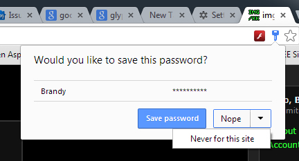
While Google didn't detail it in their changelog, Chrome 37 also includes the new password manager interface that existed on the beta for Chrome 37. When on the login page for a website, a key will appear in the search bar with a list of all saved passwords for that website. This also replaces the bar that would appear at the top asking to save a username and password after entering it for the first time.
Google's changelog also states that Chrome 37 has a number of new APIs for apps and extensions, as well as many under the hood changes for improved performance and stability. There are also 50 security fixes, with the most interesting or significant fixes detailed in the source below.
Source: Google Chrome Blog


35 Comments
View All Comments
CSMR - Tuesday, August 26, 2014 - link
IE11 has poor font rendering.XP had good font rendering technology with Cleartype (subpixel antialiasing) which was tweaked in later OSes.
IE11 however does not use Cleartype but a type of greyscale antialiasing instead. Therefore text is less sharp than what we have been used to since XP. (MS has made the same backwards moves in the Windows 8 tablet interface and Office 2013.)
epobirs - Wednesday, August 27, 2014 - link
ClearType doesn't work well when the attitude of the display panel is subject to change, making it ill-suited to the tablet/smartphone era.CSMR - Wednesday, August 27, 2014 - link
This is a discussion about desktop apps, including desktop IE and Chrome for windows. Desktop IE11 has this problem.For tablet and smartphone rendering, yes greyscale antialiasing compensated for with higher dpi may be a fine solution, although there is nothing preventing sub-pixel antialiasing either differently for each orientation or only turned on when in the normal orientation.
Tegeril - Wednesday, August 27, 2014 - link
"Desktop IE" runs on tablets.jabber - Wednesday, August 27, 2014 - link
Give it an AdBlocker and a bit more Tracking control and I might be tempted.jdub_06 - Tuesday, November 4, 2014 - link
chrome probably still leads in performance and stability... the only big issue it has is it seems to eat ram for breakfast. at least on windows, havent run linux recently enough to know...but have googled it and im not alone in this issue.JDG1980 - Tuesday, August 26, 2014 - link
For those who prefer GDI font rendering to DirectWrite, is there a way to switch back? DirectWrite is pretty much designed for high-DPI displays only; without sharp snapping to the pixel grid, it looks crappy and blurry on standard resolution screens.BillyONeal - Tuesday, August 26, 2014 - link
Actually the opposite. The whole reason for DirectWrite's existence is to make fonts look better on low-DPI displays. If you have enough DPI then no font smoothing tech is necessary.greatcaffeine - Tuesday, August 26, 2014 - link
Go to chrome://flags in the browser, and you'll find a flag to disable DirectWrite.Flunk - Tuesday, August 26, 2014 - link
Turn off Cleartype font antialiasing in the control panel. Then you'll get your "sharp" text and you'll get it in everything.