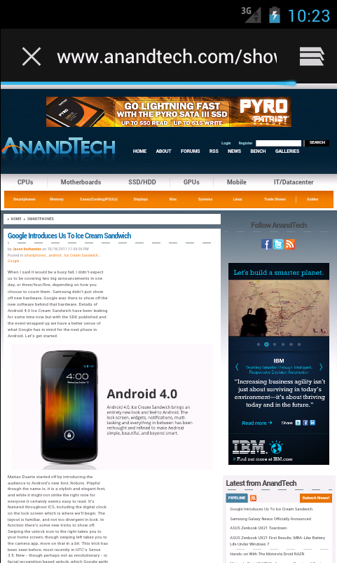
Google Introduces Us To Ice Cream Sandwich
by Jason Inofuentes on October 18, 2011 11:06 PM EST- Posted in
- Smartphones
- Android
- Ice Cream Sandwich
- Mobile
When I said it would be a busy fall, I didn’t expect us to be covering two big announcements in one day, or three/four/five, depending on how you choose to count them. Samsung didn’t just show off new hardware, Google was there to show off the new software behind that hardware. Details of Android 4.0 Ice Cream Sandwich have been leaking for some time now but with the SDK published and the event wrapped up we have a better sense of what Google has in mind for the next phase in Android. Let’s get started.
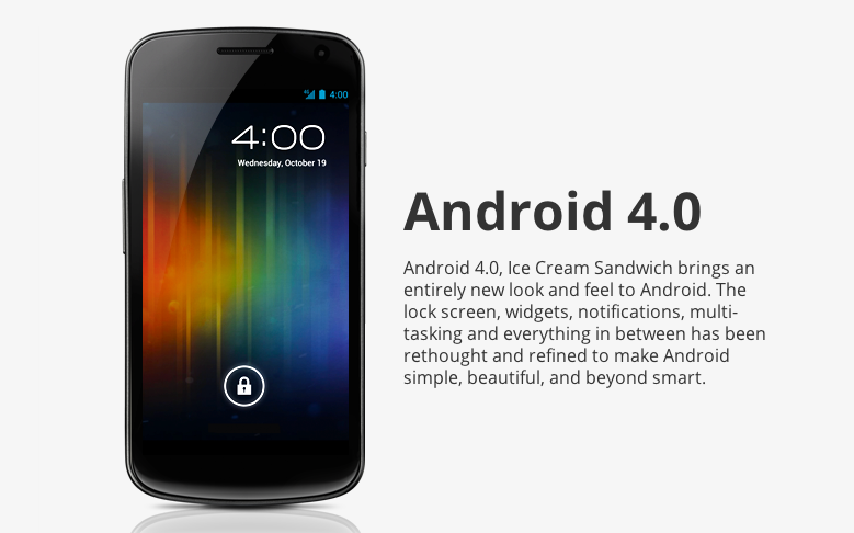
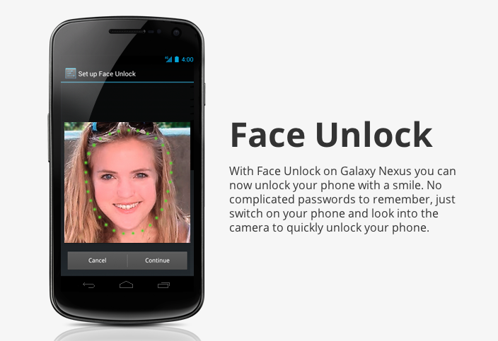
Matias Duarte started off by introducing the audience to Android’s new font, Roboto. Playful though the name is, it is a stylish and elegant font, and while it might not strike the right note for everyone it certainly seems easy to read. It’s featured throughout ICS, including the digital clock on the lock screen which is where we’ll begin. The layout is familiar, and not too divergent in look. In function there’s some new tricks to show off. Swiping the unlock icon to the right takes you to your home screen, though swiping left takes you to the camera app, more on that in a bit. This trick has been seen before, most recently in HTC’s Sense 3.5. New - though perhaps not as revolutionary - is facial recognition based unlock, which Google aptly calls Face Unlock. This was a feature in my Lenovo S10 from several years back, and judging by the demo this implementation may face the same hurdles as that Lenovo, poor lighting leads to poor recognition. This may pan out, though right now it seems like a solution searching for a problem.
The gold standard for notifications systems has been WebOS since its introduction, with Android following close behind. In its latest incarnation the differences are mainly cosmetic and in the addition of a music notification with playback controls and the ability to swipe away individual notifications. These are features that we’ve seen in skinned and modded versions of Android for some time, but welcome nonetheless. What we haven’t seen is the ability to peek at notifications from the lock screen and then go directly into the app that originated the notification upon unlock.
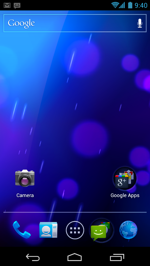
Having unlocked your phone you are now presented with a home screen that looks like a comfortable marriage between Honeycomb and Gingerbread. Honeycomb’s on screen buttons have evolved and are delightfully animated, and though anchored to the bottom or right hand side of the device, depending on orientation, they rotate appropriately. This area is called the System Bar, and will also be home to the Notification shade on tablet ICS devices. Just above the System Bar is the Favorites tray, an evolution of the docks we’ve seen before. Here you’ll find icons for Phone, People, Messaging, Browser and, of course, App Drawer, though it will be highly customizable, even supporting Folders. When you do decide to open an app, the Favorites tray becomes the Action Bar and provides contextual actions for the app you’re in. It can be at the top or bottom of the screen and can change configuration within the app based on context. In the Gmail demo, for instance, they showed how while in the Inbox the Action Bar had buttons to compose a new message, search your messages or access labels. Upon opening or selecting an e-mail, new buttons populate the Action Bar. Adopting the Action Bar will be a key UI element in ICS apps.
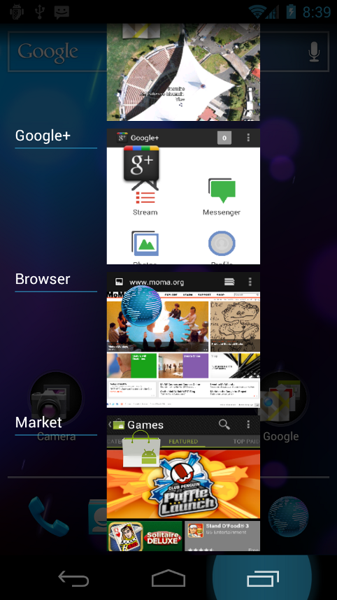
Back to the home screen, Google apps are now resizable and that functionality will be opened up to developers. The familiar home and back buttons are rejoined by the Recent Apps button from Honeycomb. This multitasking implementation looks and works very similarly as in the tablet OS, with the added ability to kill individual tasks with a swipe. This was an oft lamented absence in Honeycomb, as the list of apps could get quite long after several days of use.
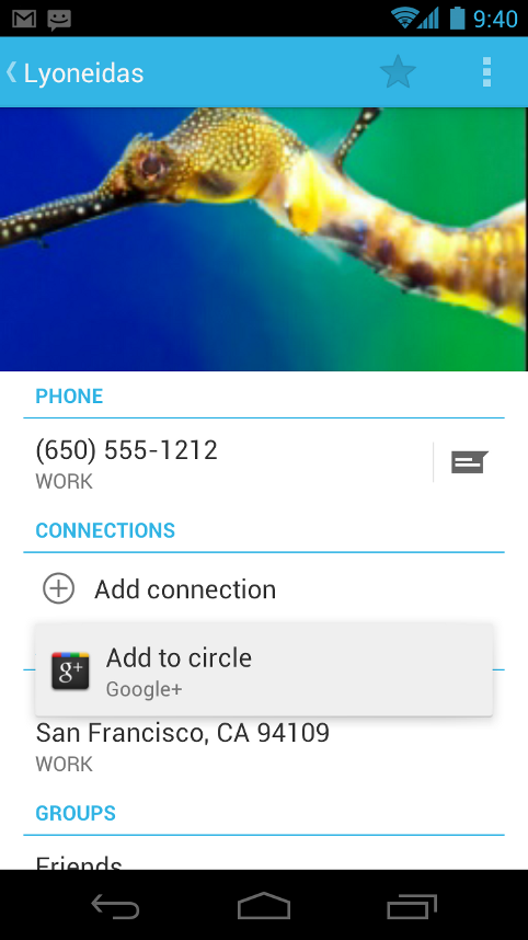
Phones are meant as communications devices so Google spent time on the Phone, Messaging and People apps. The People app replaces the Contacts app of old, and is livened up with larger pictures and a lot more data. Opening a contact’s profile reveals the typical list of numbers and e-mails, but it also includes connections through social media, and a swipe to the left reveals an integrated aggregation of that contact’s updates within those networks. They’ve also included a new Favorites tab that introduces a UI concept that we’ll see recurring in Android from now on, and it may look familiar to Windows Phone 7 users. The Favorites tab displays larger high resolution images of your most common contacts in a tightly aligned grid that is described as a ‘magazine style UI’ and bears a striking resemblance to the panels popular in Microsoft’s Metro UI.
The Phone app has been updated with in-line visual voicemail (through Google Voice) amongst your call log, and a Favorite’s tab, as in the People app, that allows you to call common contacts with one touch instead of opening their profile first. Calling one of your contacts yields a new in-call screen that features a large profile image overlaid with call information and call functions.
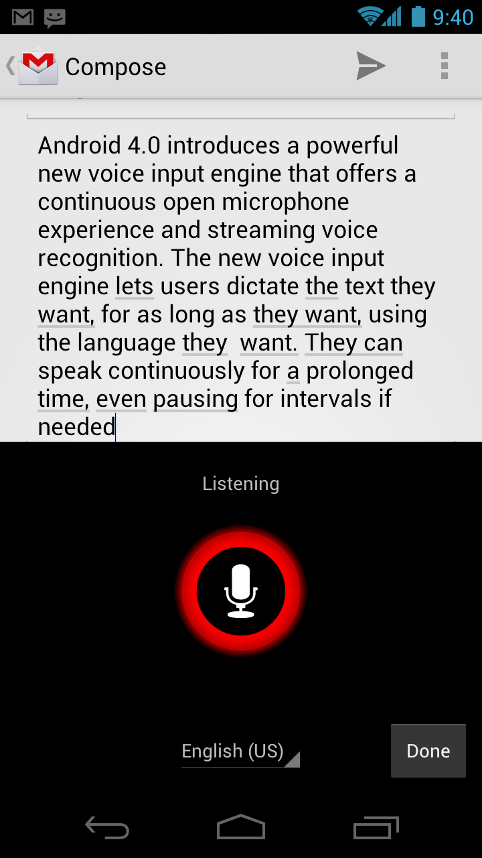
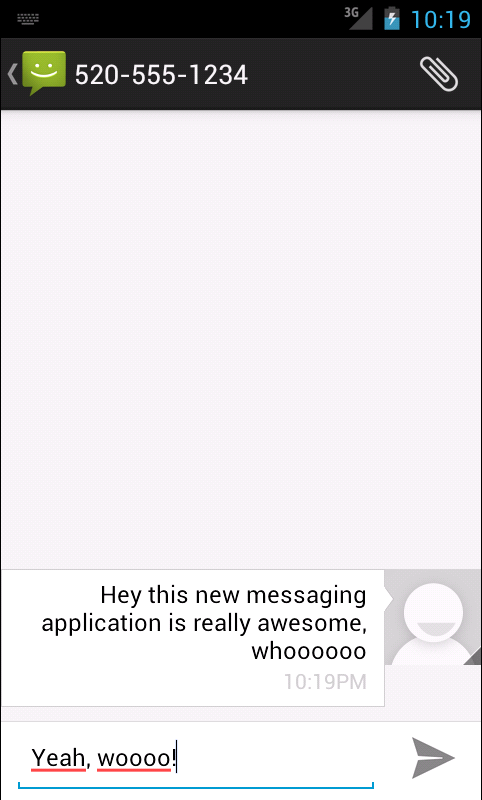
The Messaging app gets its biggest update from the improved keyboard, which has in-line spell check, improved word suggestion with easier to select options, and a refined way to add words to the dictionary. The voice recognition functions of Android have been improved and they’ve implemented an ‘open microphone’ experience that allows you to dictate long messages and insert punctuation, regardless of any pauses you might have while composing. The engine even supports emoticons.
Screenshot of the article, within the article... How meta.
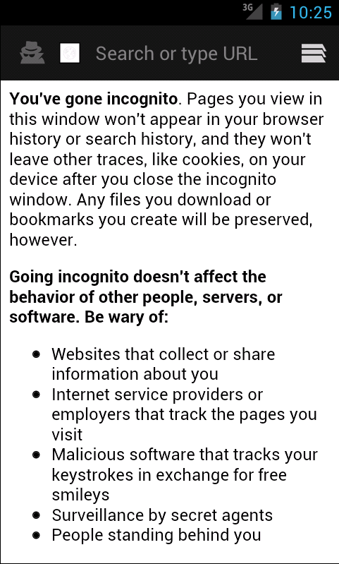
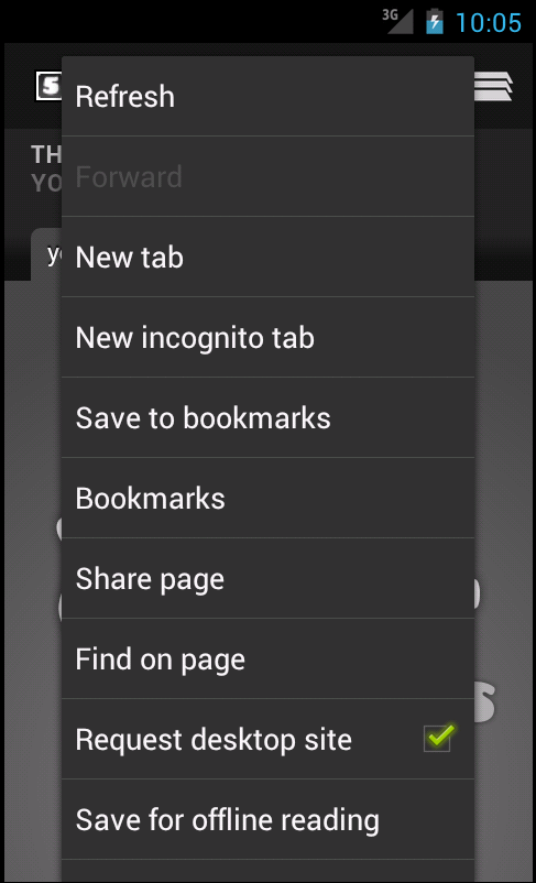
The Browser gets a new ‘Save for off-line reading’ function that is aimed at more than just storing articles, but can include things like boarding passes, and train schedules. It also gets a tab management system that mirrors the Recent Apps function. The stock android browser now also includes incognito mode, which no doubt will be used in conjunction with Flash for lots of scientific research.
Every browser iteration from Android features performance improvements and this one is no different. Google notes that the stock Android browser gets much improved rendering speed through an improved and updated version of WebKit, and faster JavaScript performance thanks in part to an update to V8's crankshaft JIT engine. Google claims an improvement of 220% in Android 4.0 over Android 2.3 in V8, and 35% faster SunSpider 0.9.1 performance on the Nexus S alone. We look forward to testing out this improved Android browser and seeing what other improvements are lurking inside very soon.
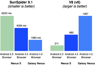
Google's Browser Performance Benchmarks (Courtesy Google)
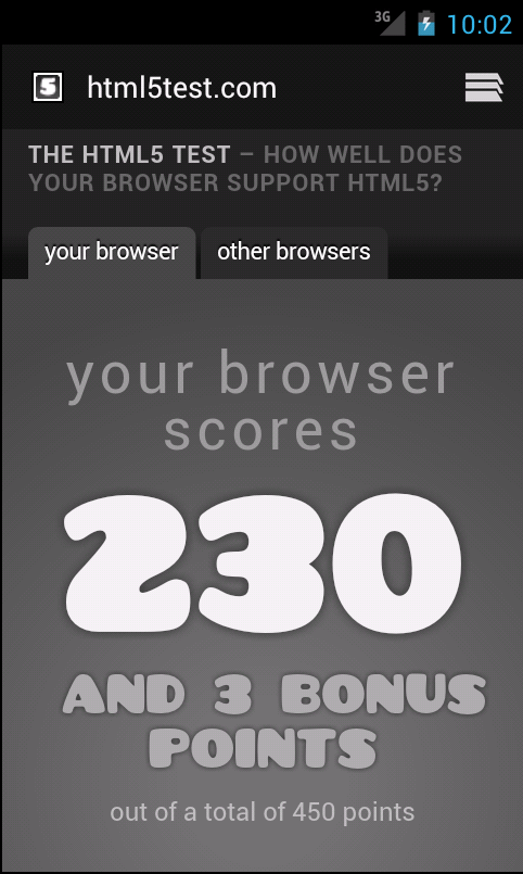
In the emulator the benefits of this new version of WebKit are readily visible, where Android 4.0's browser scores 230 and 3 bonus points, compared with 177 and 1 bonus point in Android 2.3.5. The new browser also thankfully now exposes a desktop user agent switcher, something that has been missing for far too long from the stock Android browser.
The Calendar app gets a new layout and features pinch to zoom for easily shifting from a broader to a more granular view of your agenda, and back again. They’ve extended the use of the swipe here to allow you to go back and forth between days/weeks/months. This same motion is found in the new Gmail app for browsing through e-mails quickly. And that Gmail app now gets two-line previews along with the other UI changes.
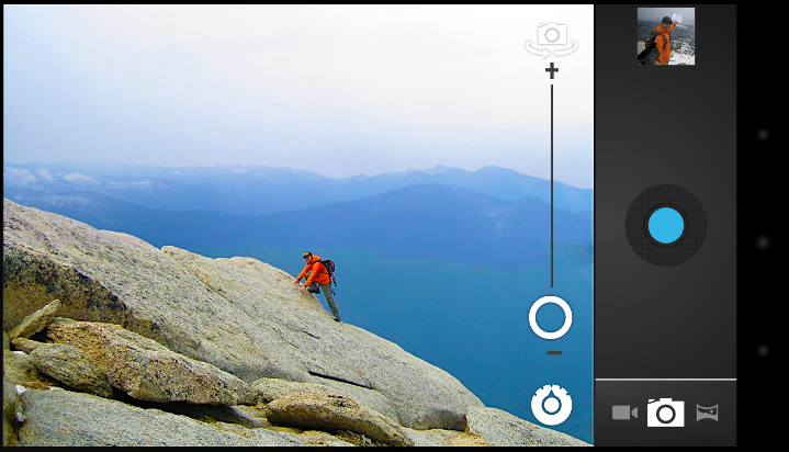
The Camera and Gallery apps have seen much work, and zero shutter lag exposure and a facial recognition function that keeps the image focused on identified faces are among the highlights. For Video the ability to zoom and continuously focus the shot while filming is a boon. And a new panorama mode allows users to easily create long shots with just a single motion, on the device and with a simple on-screen guide. Sharing from the redesigned Gallery app is a two tap affair, and the integrated photo editor allows cropping, rotation, red-eye reduction and the application of filters to captured photos. The Gallery itself is graced with that ‘magazine style UI’ and can be used to build Albums but can also sort pictures by location and faces.
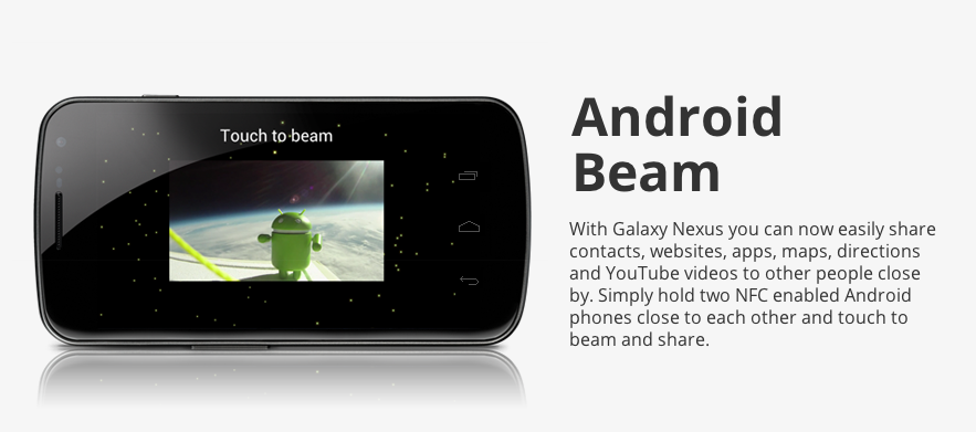
NFC features prominently in Google’s plans with Google Wallet, and gains added functionality with Android Beam, which allows sharing of everything from files to links between two NFC enabled ICS devices.


That was certainly a lot to go through, and there’s no doubt more to cover another time, for now, we can’t wait to get our hands on the Galaxy Nexus to find out what Ice Cream Sandwich feels like in action. And in the meantime we’ll dig around the readily available SDK to see what there is to see. November’s going to be a great month to shop for phones.
Source: Android 4.0 Highlights


36 Comments
View All Comments
Spivonious - Wednesday, October 19, 2011 - link
I see Google copying a lot of WP7. Does this mean they're taking them seriously as a competitor?JasonInofuentes - Wednesday, October 19, 2011 - link
I think it's fair to say that while no one is so far threatened by the sales of Windows Phone devices, the innovations present and the UI are taken seriously.Jason
DigitalFreak - Wednesday, October 19, 2011 - link
Keep on trolling!OoklaTheMok - Wednesday, October 19, 2011 - link
There are a few of the "new" features of ICS that WP7 has had... such as..1. The ability to swipe away notifications
2. Viewing notifications from the lock screen and being able to go to the originating app
3. The "Action Bar"
4. People Hub with social networking updates
First Google copyed the iPhone chicklets, now it is copying the Windows Phone user experience.
Maybe in Android 5.0 they will have a consistent user experience. ICS is still a mashup of different UI paradigms.
Watapata - Wednesday, October 19, 2011 - link
While Google has certainly drawn some inspiration from both Microsoft and Apple with ICS, you are clearly misinformed on the examples you've provided.1) The ability to swipe away notifications has existed in custom Android ROMs for ages now, if anything they've taken this from the ever active Android community.
2) Viewing notifications from the lockscreen has also been around in custom Android ROMs for quite some time as well. In fact, I was able to do this on my T-Mobile G1 before that had yet been out a year. It is certainly possible that implementations of this existed prior to that, but it certainly isn't a WP7 innovation.
3) The 'Action Bar' has been an Android UI Pattern since before WP7 ever met the public eye. Before Honeycomb there wasn't an API for it and it wasn't built into the SDK, nonetheless it was a pattern Google urged developers to begin implementing themselves. There is actually a Google I/O 2010 workshop video on YouTube about this.
4) Contacts on Android have had social networking updates integrated for years now. The 'People' app is nothing more than a redesign of this. I won't argue that it isn't heavily influenced by WP7, but the feature is hardly something new or even remotely unique to WP7.
Again, Google has certainly copied some features from Apple and Microsoft. At the same time, each has certainly copied some features from Google. It would hardly be rational to argue otherwise. Despite this, what was shown yesterday for ICS is in no way a copy of the WP7 user experience. Portions of the presentation are similar at best, but the UI concepts are completely different.
There is certainly room to improve consistency within the OS, but from the looks of things this is a massive step forward from Gingerbread, which was in turn a massive step forward from Froyo. It will only get better, as it should. This will only serve to drive improvements in the other OS's as well.
gtguy256 - Wednesday, October 19, 2011 - link
Hurtles should be hurdleshurtles means something coming towards you at speed, hurdles means obstacles to be overcome
JasonInofuentes - Wednesday, October 19, 2011 - link
Fixed! Thanks!jaydee - Wednesday, October 19, 2011 - link
And now my ancient 5-month old phone (HTC Thunderbolt with 2.2) is 5 generations behind. (2.3-3.0-3.1-3.2-4.0).cplusplus - Wednesday, October 19, 2011 - link
All of the 3.x versions were tablet-only, and no phone out there has them. So you're 2 generations behind (2.3 and 4.0).anactoraaron - Wednesday, October 19, 2011 - link
"What we haven’t seen is the ability to peek at notifications from the lock screen and then go directly into the app that originated the notification upon unlock."My Samsung Exhibit 4g has missed call and text notifications built into the lock screen and it is as easy as sliding a puzzle piece to unlock the phone directly into that app. So again nothing new here. Maybe just a better implementation of it.