The Windows 10 Fall Creators Update Feature Focus
by Brett Howse on November 10, 2017 8:00 AM ESTFluent Design
First announced at the Build 2017 developer’s conference, Fluent Design is the first major overhaul of the Windows 10 design and theme since Windows 10 washed away the remnants of Windows 8 back in 2015. Overall, the original design of Windows 10 has served it well, and it has been made clear after using it for the last several years that lessons were certainly learned from Windows 8, and those lessons were applied to Windows 10 to make a much more coherent and usable design language. But, as with anything, there’s always room for improvement, and the Redmond company is hoping that Fluent Design not only improves on the original, but keeps the UI and theming fresh.
Windows 10 runs on many different devices. The scalability of it is somewhat amazing, and after years of wanting to consolidate it’s OS efforts across device categories, it seems to have finally happened with Windows 10. But that brings some challenges as well, and as hardware has continued to evolve, we’ve started to see many different usage scenarios that traditional mouse and keyboard input would never work on. Touch, of course, is the most obvious and pervasive of these, and falls into the 2D category of input methods, along with keyboard and mouse, stylus, and more of the input methods we are used to. But we now live in a world with virtual reality, and augmented reality, both which live in the 3D space. There’s also 0D devices, such as the recently announced Cortana powered Harmon Kardon Invoke speaker and similar devices such as the Amazon Echo. IoT is becoming pervasive, and appears to be the next growth target in computing.
Fluent Design targets more than just 2D with five basic concepts: light, depth, motion, material, and scale. It may seems like a simple idea, but the key Fluent Design is that it will work well across different device types, but still be very useful on the traditional PC where Windows 10 still has its largest audience.

The move from Windows 7 to Windows 8 was pretty jarring, and the design language was very much flat and blocky. Windows 10 had already added some of the depth back in, but with Fluent Design they have also brought the essence of Windows 7 Aero back, along with new elements as well.
It’s tough to discuss Fluent Design without seeing it, because it’s not just a static idea. All of the elements tie in together to make the experience easier to navigate, more coherent, and more immersive. Check out this video that Microsoft created for their Dev Day:
Light is one of the key elements for selection, and this is doubly the case when you’re thinking of VR and AR technology, where a light gaze can be your pointer. Subtle highlights in lists give a stronger sense of where you are, and what you’re selecting.
Depth plays a big part too, and in the video you can see how going forward and backward in apps gives the feeling of going into an app or image, and then back out, connecting the experience of movement with where you are. This also plays into the motion, where you’ll see parallax scrolling and more.
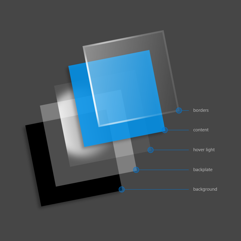
Material selection is the transparency effects that will likely remind most people of Aero, but it is much more than just blurring. Instead of just background colors and blur, they will be doing multiple layers with Gaussian blur, exclusion blend, color and tint overlays, and tiled noise texture. The acrylic material can bring additional layering and depth to the app as well, but material is also able to be tied into scale, where if an app is in a windowed mode, it can have some blurring, but in a full-screen view, the blurring is eliminated to create focus on the one app.
Scale is likely the most underrated of them all, but Windows 10 is designed to work on everything from IoT to PC to Xbox to Surface Hub, so scale is critical to creating an app which will work across all of those form factors.
It’s hard to deny that Fluent Design is both form and function. There are design elements that are going to improve usability, but those same design elements also just look great. As we move forward, hopefully we’ll start to see more and more of this appear inside of Windows 10 and in the apps we use.
That’s really the only downside to Fluent Design right now though. There’s some of it sprinkled inside of Windows 10, and there’s work to be done to bring it more prominently to the forefront. The Action Center, for instance, has some elements of Fluent Design, but hovering over one of the notifications doesn’t bring any lighting effects to let you know you’re able to select it. Only some of the built-in apps have support right now. This will come over time, and likely even more slowly for third party apps, but it’s not here yet, at least not to its full extent.


95 Comments
View All Comments
ddriver - Friday, November 10, 2017 - link
Oh wow, I bet those 10 seconds you save are a life changer.inighthawki - Friday, November 10, 2017 - link
Oh come on. He's booting into several different OSs a day. That's at least a full minute.ddriver - Friday, November 10, 2017 - link
Yeah, and they are all windoze 10, which saves that much time :)I was talking about the boot time difference relative to w7, not the overall boot time.
I usually run at least 2-3 OS in the same time, it is much faster and far more usable when you use virtual machines rather than booting one OS at a time. You get to use them in parallel and also avoid the mobo post time. The only downside is you need plenty of ram.
ddrіver - Sunday, November 12, 2017 - link
Well, not actually every few months but easily every couple of days.ddriver - Friday, November 10, 2017 - link
Windoze 10 is a great OS, I just has an amazing experience with it the other day with its latest and greatest iteration.A laptop was behaving weirdly, so I decided to do some checkups, beginning with a disk check.
Clicking to run the disk check, I was told that there is no need to run it because the disk is OK.
I insisted to run it nonetheless, and to automatically fix errors.
About 1 second in the check, I was told that the error check cannot continue because the drive contains errors, and to run it again after I fix the errors.
Great functionality, I have to admit. It's like ordering pizza and they tell you they can't deliver you pizza because you have no pizza, and to call back again when you have the pizza.
And what stunning graphics design, for example the settings dialogs are literally just a white background with 3 columns of text. It is like looking at HTML without the CSS styling applied. Just pathetic and hideous.
And in an all-too-typical for m$ fashion, they are more invested into introducing even more useless bloatware.
ddrіver - Sunday, November 12, 2017 - link
Then again I haven't actually done any troubleshooting without Google for so long... Google 1, M$ 0.And they could make those Windoze 10 menus with gold and glitter and they'd still suck. Because they're M$.
ddriver - Monday, November 13, 2017 - link
LOL, I have a copy-troll now.ddrіver - Monday, November 13, 2017 - link
Mispost.jardows2 - Friday, November 10, 2017 - link
Protected folder option - great! Going to be checking this out and enabling on all my computers. I wonder how it works with network mapped drives? Will this folder have to be selected as a protected folder on all PC's that have write access?peevee - Friday, November 10, 2017 - link
Brett, where are multiple Linux flavors?